MODULE 4: INFORMING CONTEXTS. WEEK 4.

Copyright James Bellorini 2019.
If you’ve read any of my posts over the past few days then you’ll know that I’m taking a long hard look at my current practice and how certain elements or changes can alter the meaning of an image. This began with looking at the external context as related to the viewer but has moved onto the integrity of the image content itself.
I began by cropping a series of my images into square format (usually most of my images remain uncropped).
I’ve now gone one step further and turned some of those monochrome. Not necessarily as permanent changes, but to look at what is ‘necessary’. What is communicating? Why do I use colour almost exclusively in my practice? Why do I rarely question the aspect ratio of my images? If these elements are altered what does it mean to me, to the work, and potentially the viewer?
I’m framing some of this in the context of Barthes discussion of the meaning of text in his essay The Death Of The Author (1977) who uses the semiotic ideas of the signifier (i.e. the thing itself, the object, the image etc) and the signified (i.e. what the signifier means, what it stands for, the impression). For me, monochrome work sits at the signified end of the scale, stripped of colour it is all about the impression and meaning.
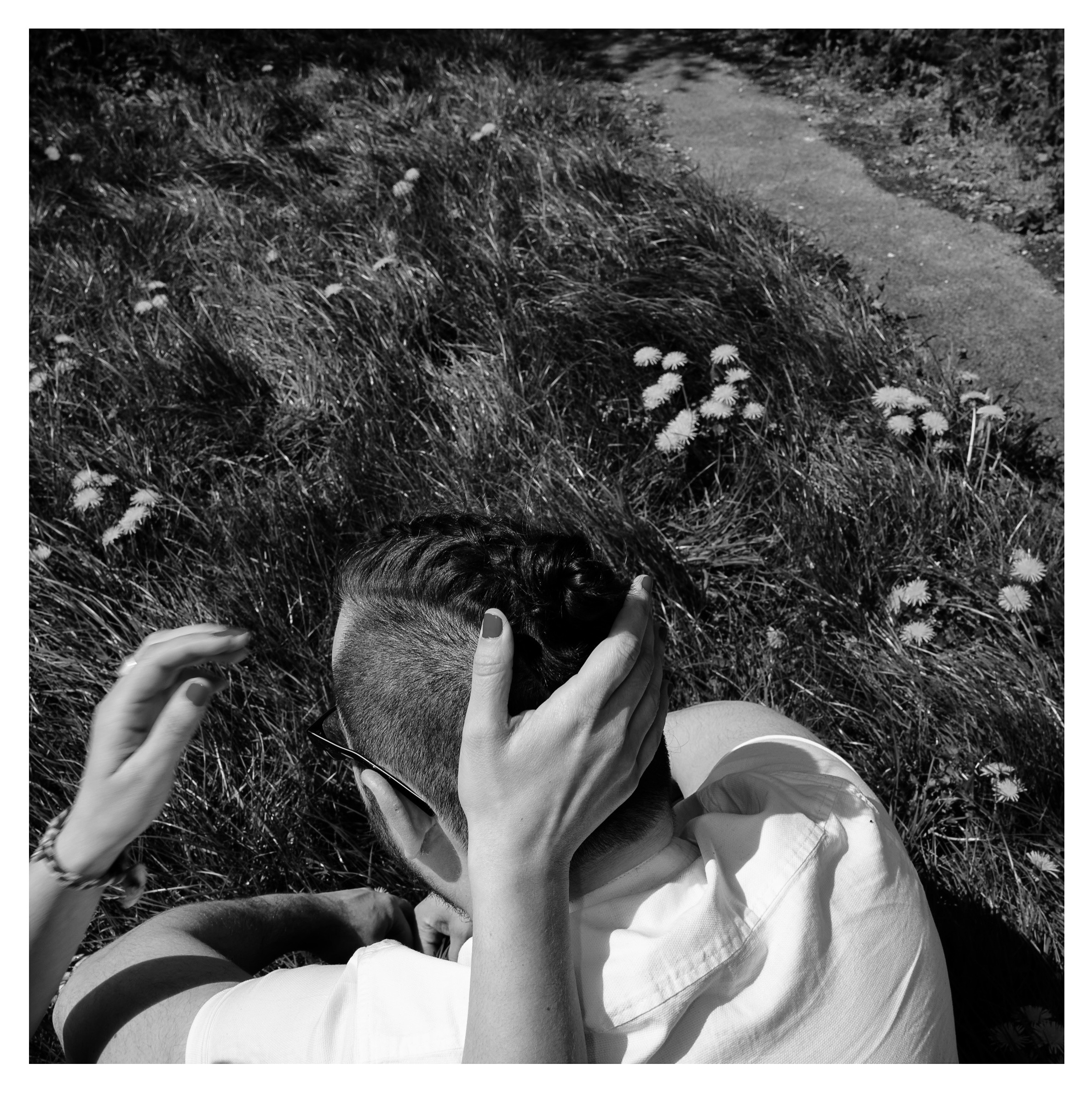
Copyright James Bellorini 2019.
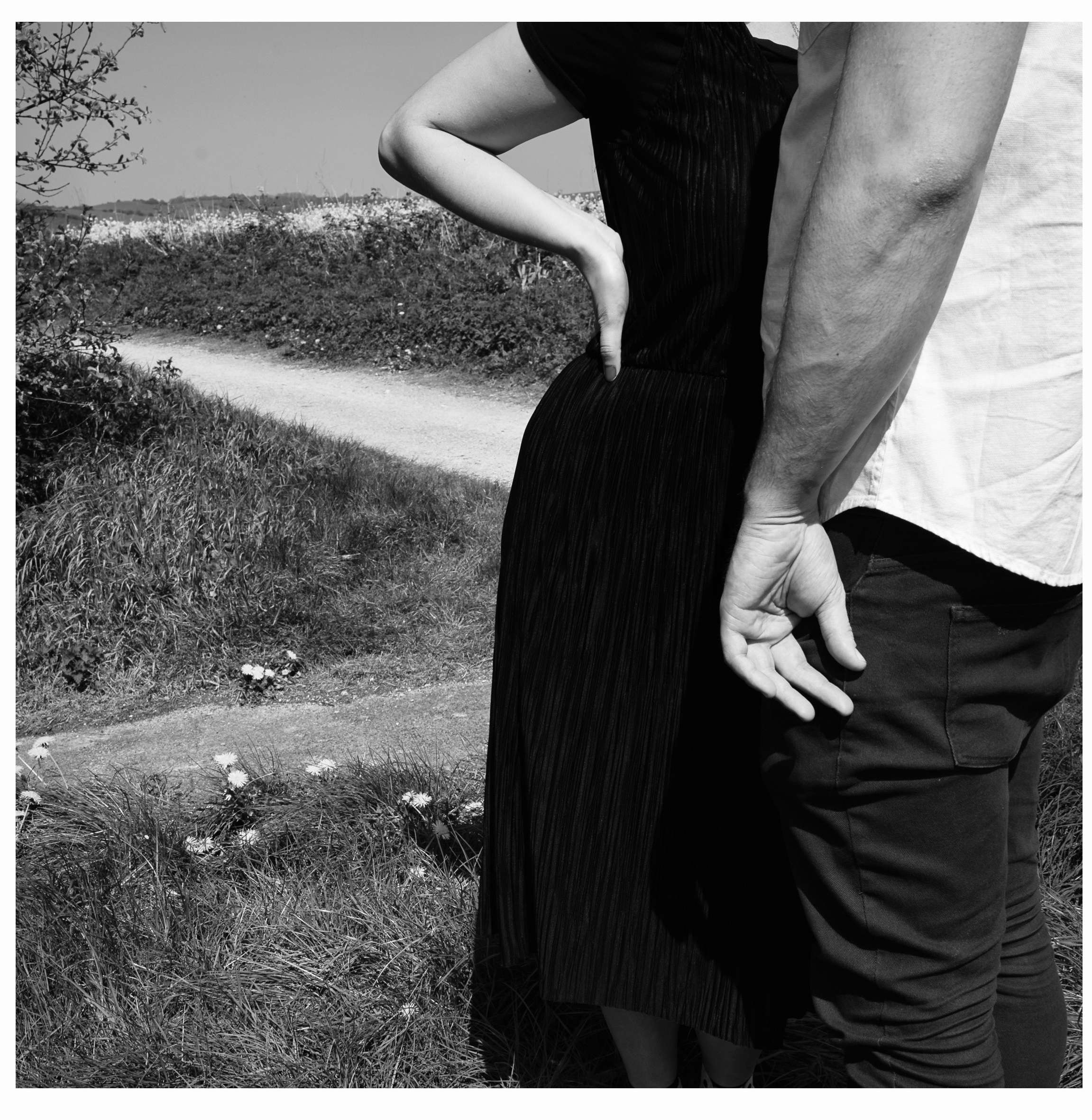
A monochrome photograph in this technicolour digital age also implies that it is a ‘serious’ photograph. It is statement of the images’ importance and aesthetic status. The photographer has deliberately chosen to set the image apart from the colour world we are familiar with; even more so if the image has been digitally converted from colour to monochrome in post-processing. That implies a choice to place the image apart from the regular day-to-day visual narrative in some way.
Although the synthetic change from colour to monochrome has resonance with aspects of the theme of my MA practice, I’m not sure it sits well with me. It is a construction that feels much more ‘fake’ than the colour-based constructed work that I am invested in. Perhaps that is because, in part, monochrome is so overtly seductive. It plays with the sensuality of surface and form that can be a distraction. It can also divert the eye, make a boring image ‘feel’ better because of this layer of sophistication even though the image remains uninteresting.
I do like the fact that it strips away the signifiers of colour we are familiar with in our every day life, and can leave us with just the signified content of the image. Yet I miss the voice of colour. It makes me realise that where monochrome might offer a great song, colour is the harmony (literally in some cases) that can get under the skin. It is more visceral, and that is important to me.
Perhaps this is why I have also found it much harder to sequence monochrome images. They seem to want to be left as singular statements, closed within their own confines. Marriage is not for them. They cannot speak in relationship with other images themselves because their personal statement is so strong.
Copyright James Bellorini 2019.
Guido Guidi in his collection Dietro Casa is the only contemporary photographer I have seen who has managed to successfully make exclusively monochrome images play in dialogue with each other. The images were mostly shot in the 1980s, but the sequencing in the book is strong and cinematic; the whole book feels like is alive and speaking due to the strength of the direct relationship between images.

Guido Guidi 2008.
REFERENCES AND RESOURCES
BOOKS
Barthes, R. 1977. (Heath, S. ed). Image, Music, Text. London: Fontana Press.
Campany, D. 2008. Photography and Cinema. London: Reaktion Books.
WEBSITES
TBW Books. Available at: https://www.tbwbooks.com/products/annual-series-no-6-four-book-set?variant=1696364363801
